Toohey Trail Run 2026 – Event Graphics
About
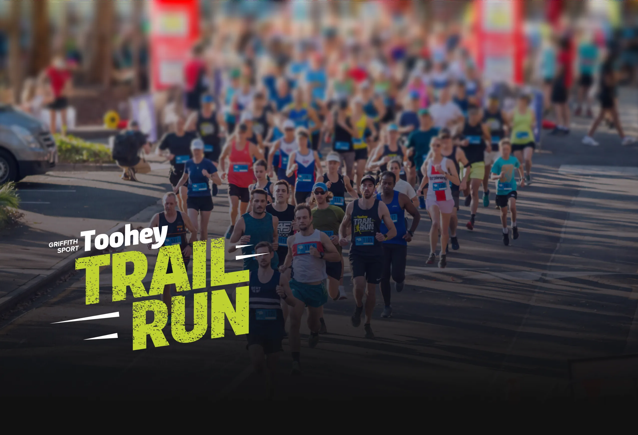
Toohey Trail Run is a popular annual event that takes participants through the scenic trails of Toohey Forest, providing a unique running experience surrounded by the local flora and fauna. Each year, event graphics are updated and applied across a variety of collateral to create a fresh look. This year the event celebrates it's 10-year anniversary.
Our task is to create vibrant, nature-inspired event graphics for the 2026 Toohey Trail Run. The client is looking for graphics that are bright and engaging, with designs that complement the natural surroundings of Toohey Forest and celebrate a decade of bringing the community together and promoting health and wellbeing. Designs should appeal to a broad age range and feel inclusive. These graphics will be applied to event collateral, including singlets, social media, emails, medals, and a version of the logo that incorporates your elements.
The target audience: event participants and supporters, Griffith University students and staff, and local corporate partners.
Deliverables

Singlet Design

Medal

Social Media Tile

Logo Themed Version
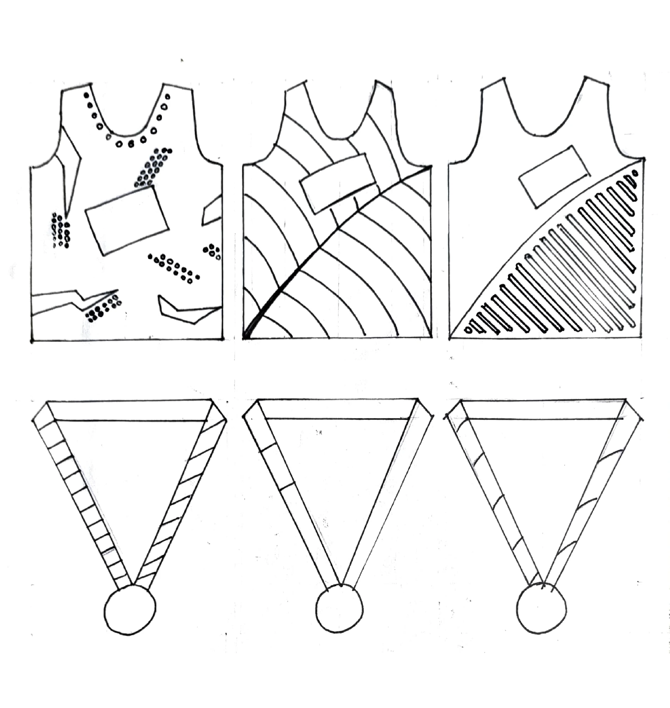
Singlet
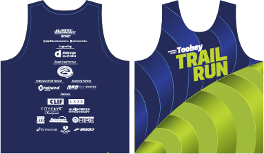
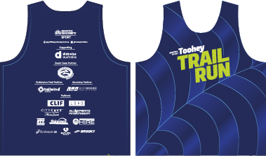
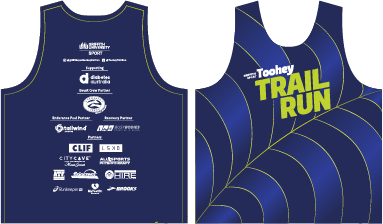
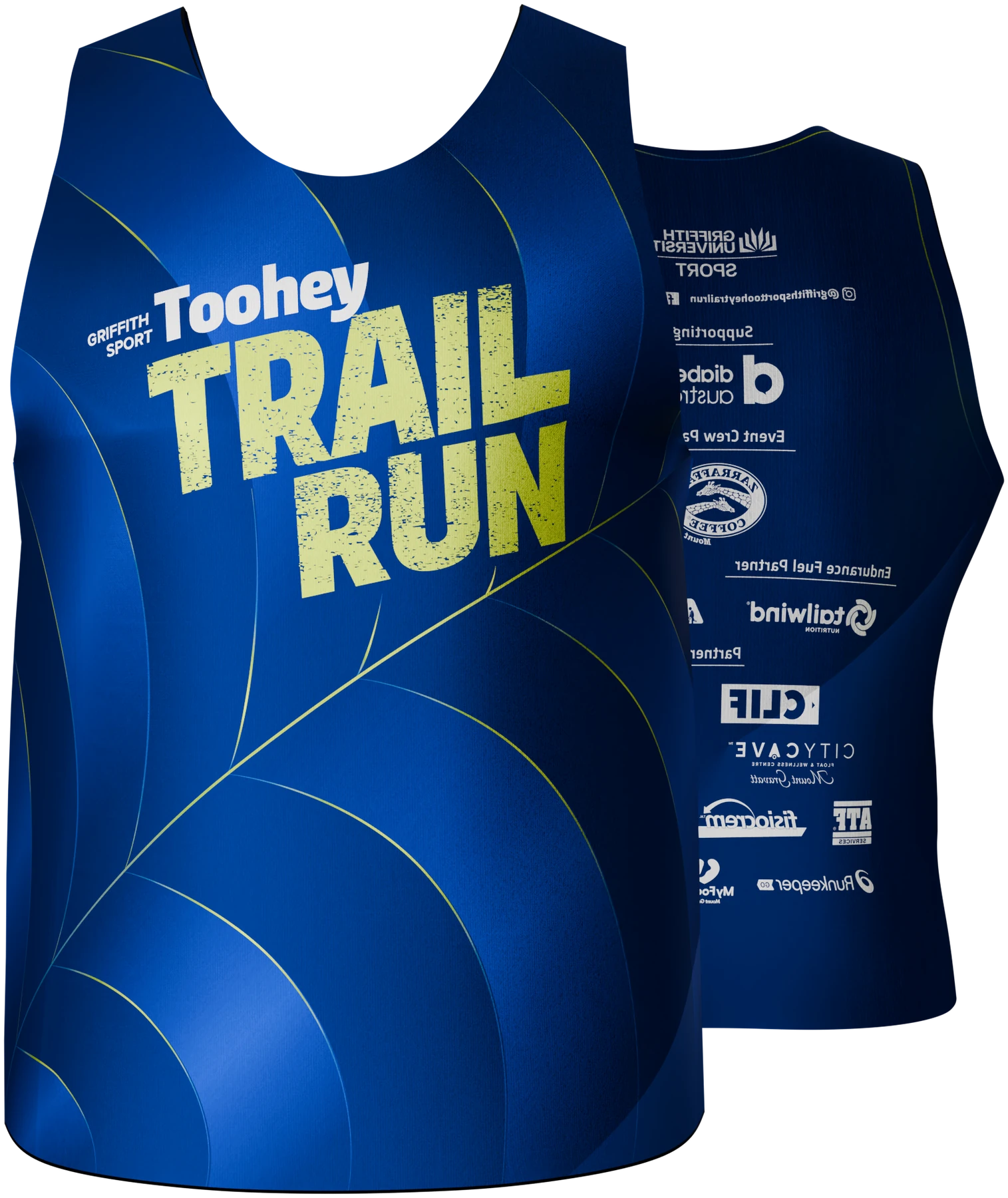
The singlet uses a mix of deep blue and light green colours. The pattern integrated into the design represents the pinnate leaf venation commonly found in broadleaf plants. In addition, the combination of this pattern with subtle gradients creates a sense of depth and an optical illusion, referencing the visual technique trompe-l’œil (“trick of the eye”), which mimics three-dimensionality within a flat, two-dimensional artwork.
The back of the singlet was intentionally kept simple to provide space for sponsor logos without introducing visual clutter.
Medal
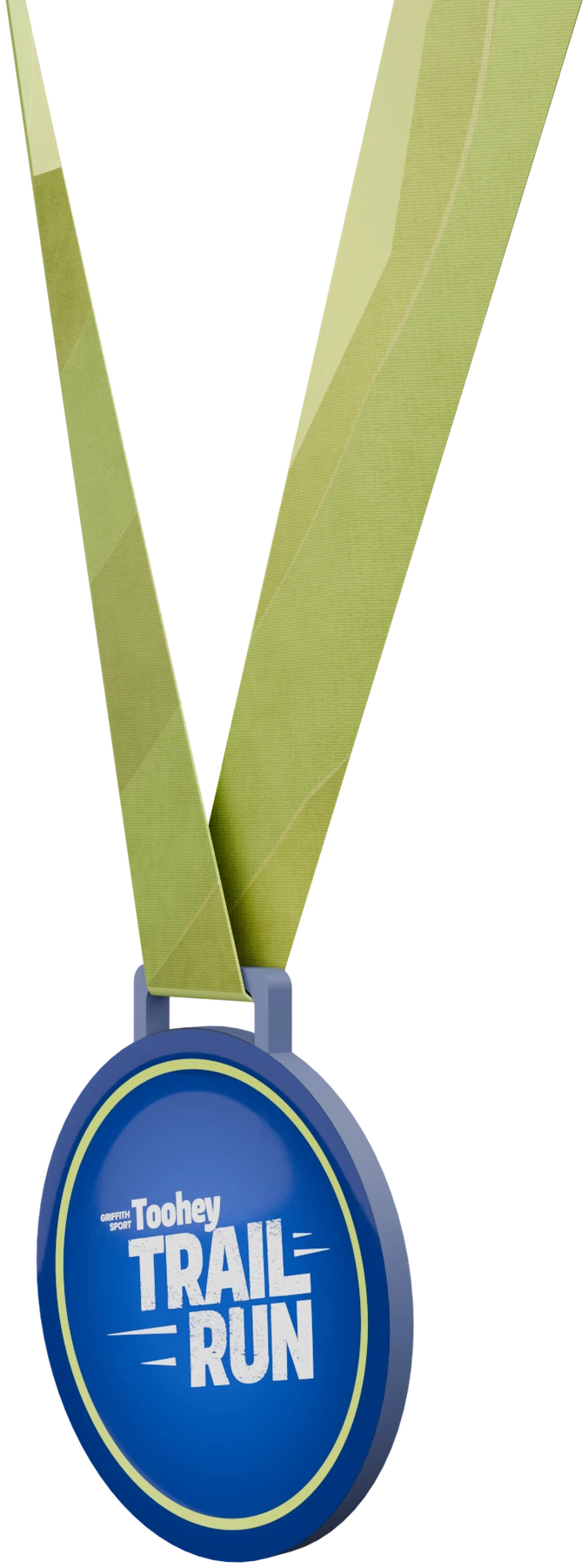
The light green medal ribbon is designed to visually complement the singlet, preferably the dark blue version. While it needs to stand out from the background, it also has to remain consistent with the singlet’s design so that both elements shared the same overall characteristics.
The medal itself is kept simple to preserve the overall balance of detail within the set.
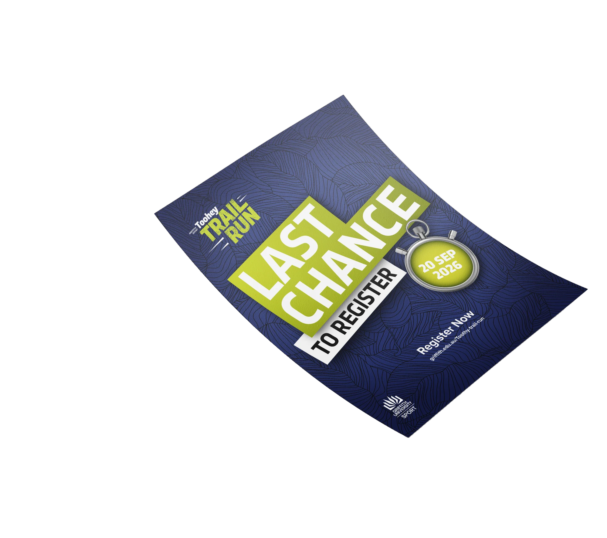
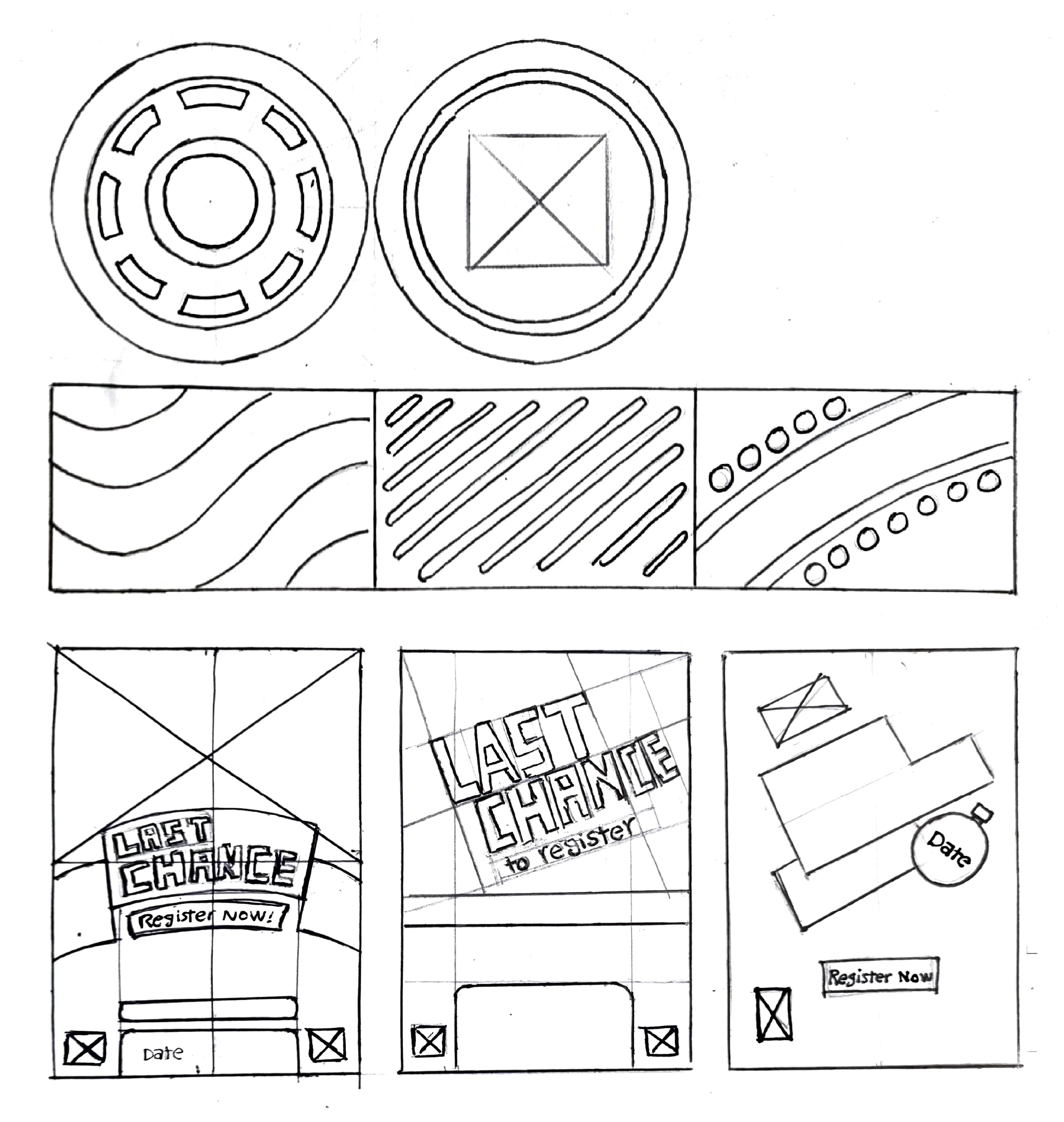
Social Media Tile
This social media tile was designed to communicate urgency and drive final registrations for the Toohey Trail Run. “Last Chance” is intentionally dominant in scale and contrast to capture attention within fast-moving digital feeds.
The angled composition introduces movement and energy, reflecting the intensity of trail running, while the lime accent creates strong visual contrast against the deep navy base. The stopwatch reinforces the time-sensitive message, and the leaf pattern maintains consistency with the event’s natural landscape identity.
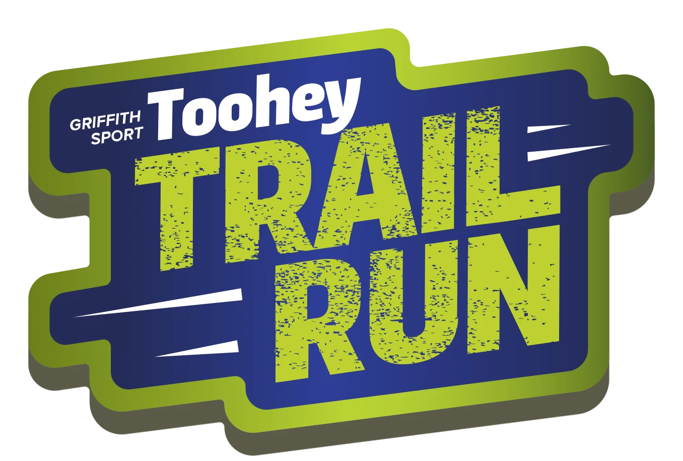
Logo Themed Version
A 3D-themed version of the logo is also provided to the client. Its most effective application is in banners and sponsor placards placed around the running track. The design incorporates a left-to-right sense of movement, enhancing the dynamic feel of the event.
Style guide


#00003C
Deep Navy
#BAD53A
Lemon Lime
#FFFFFF
White

Note: The typefaces, colour palette and logos are provided by the client.
Iterations