
Memories on paper...
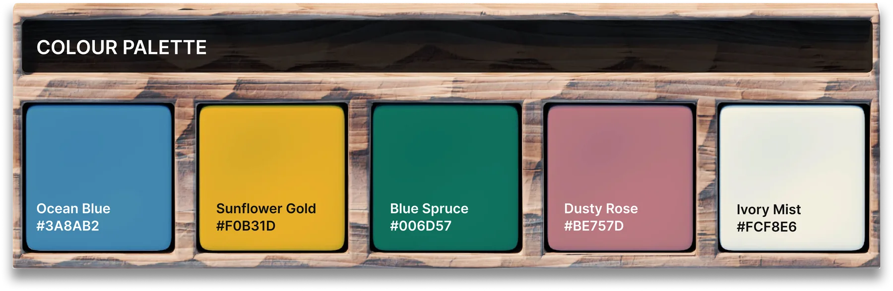
Each year Everton Park State School produces a yearbook for its graduating Year 6 students. It’s a keepsake marking the step from primary school into high school, so it had to feel worth holding onto. The school’s green and yellow stayed at the heart of the design, but unlike last year’s edition I used them as accents rather than filling every page. That gave the layouts more breathing room and a more mature feel.
Names and photographs changed for privacy.
Cover
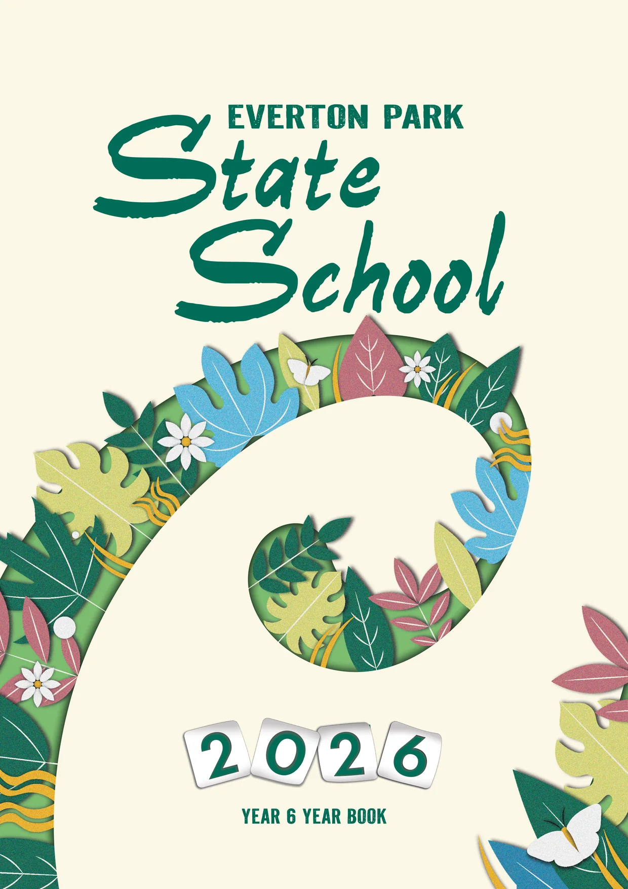
Front cover: papercut foliage in the school’s green and yellow, wrapped around the 2026 year.
Captains
Paper cream background
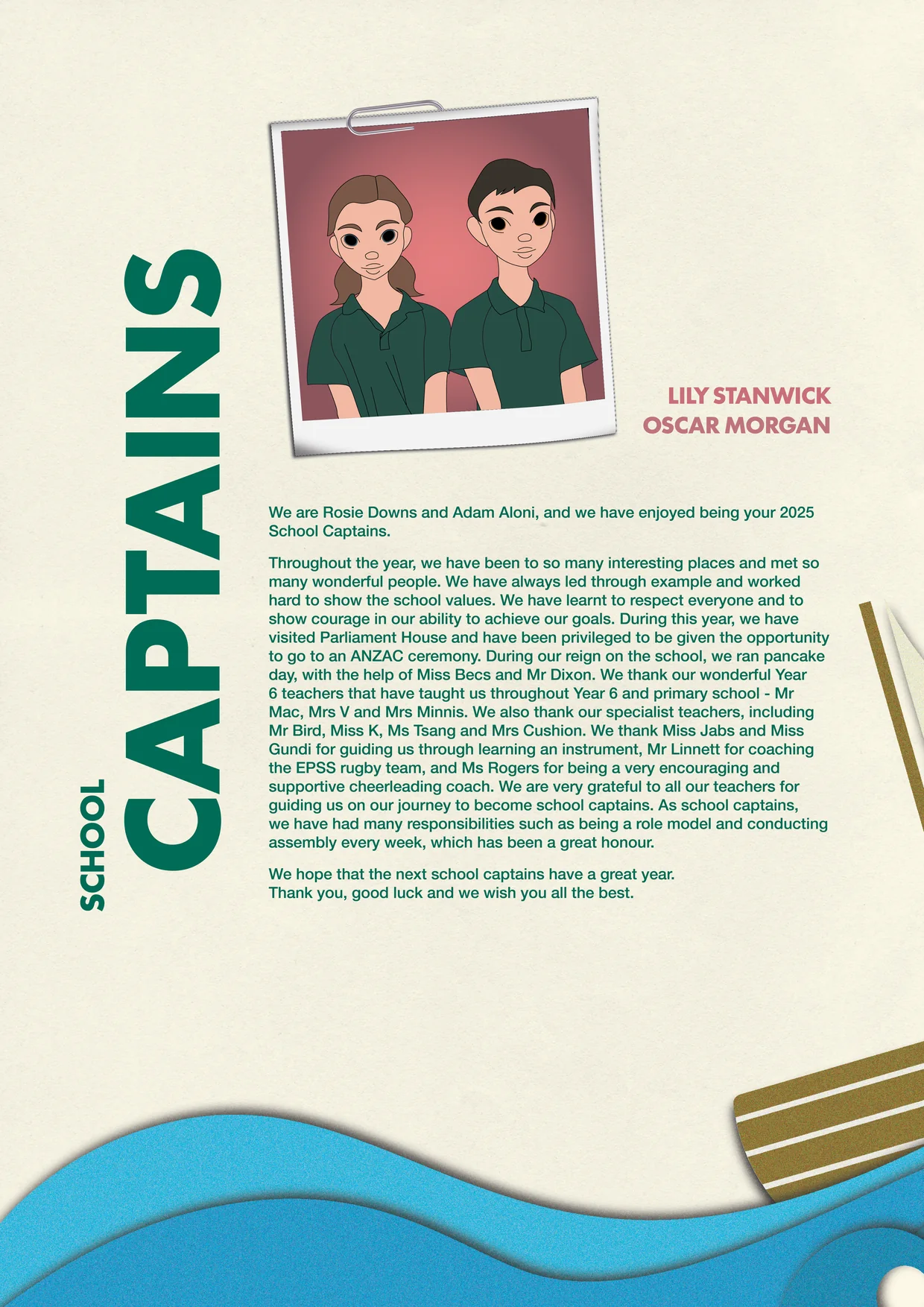
A warm paper-cream base keeps the pages soft and timeless, so the school colours can work as accents.
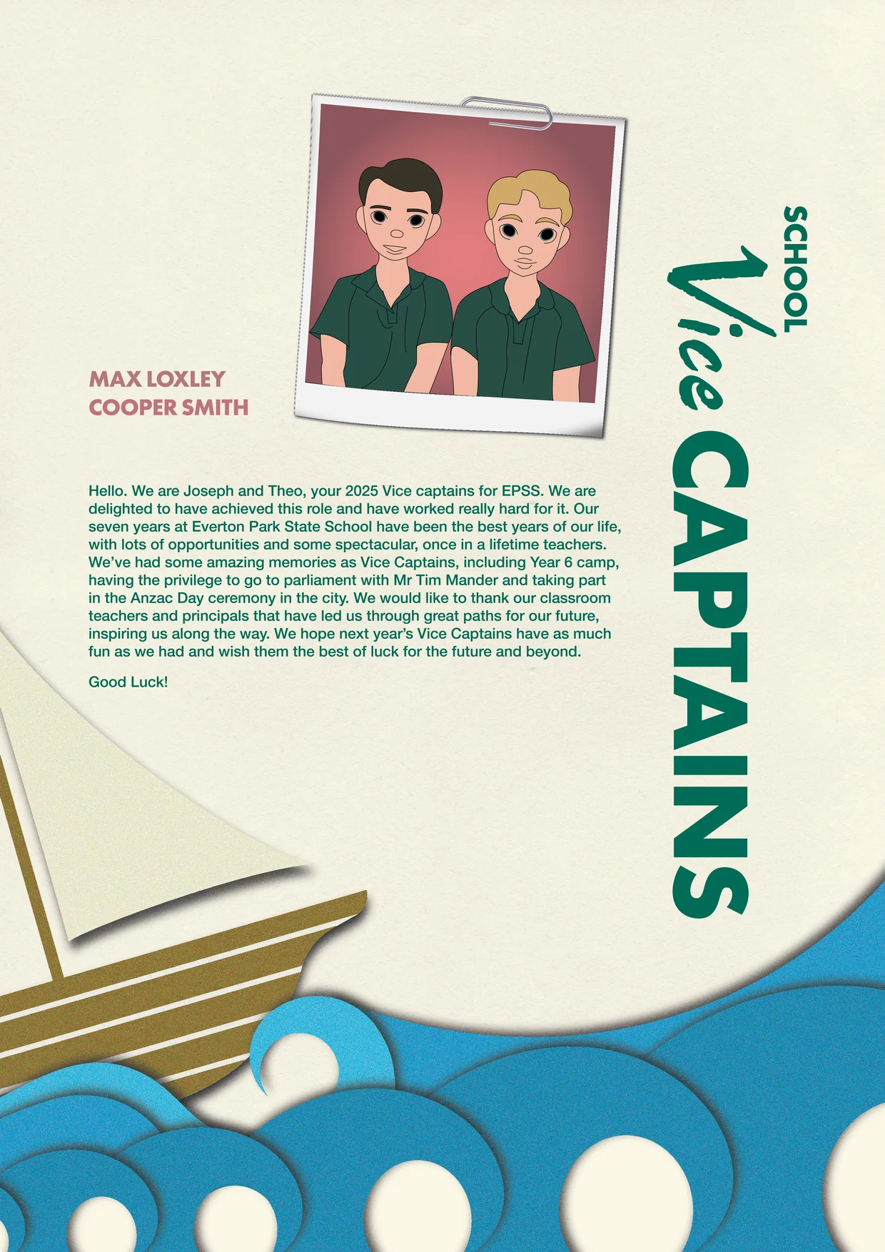
Polaroid style frames
Playful typography
Papercut illustrations
Layered papercut waves and a sailboat add depth and a handmade feel to the captains’ messages.
Paper cream background with papercut illustrations.
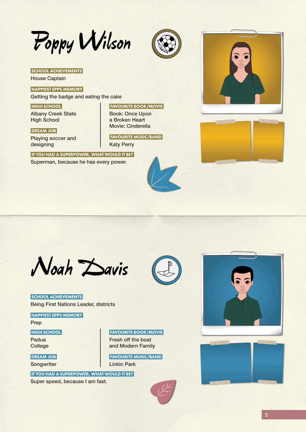
Profiles
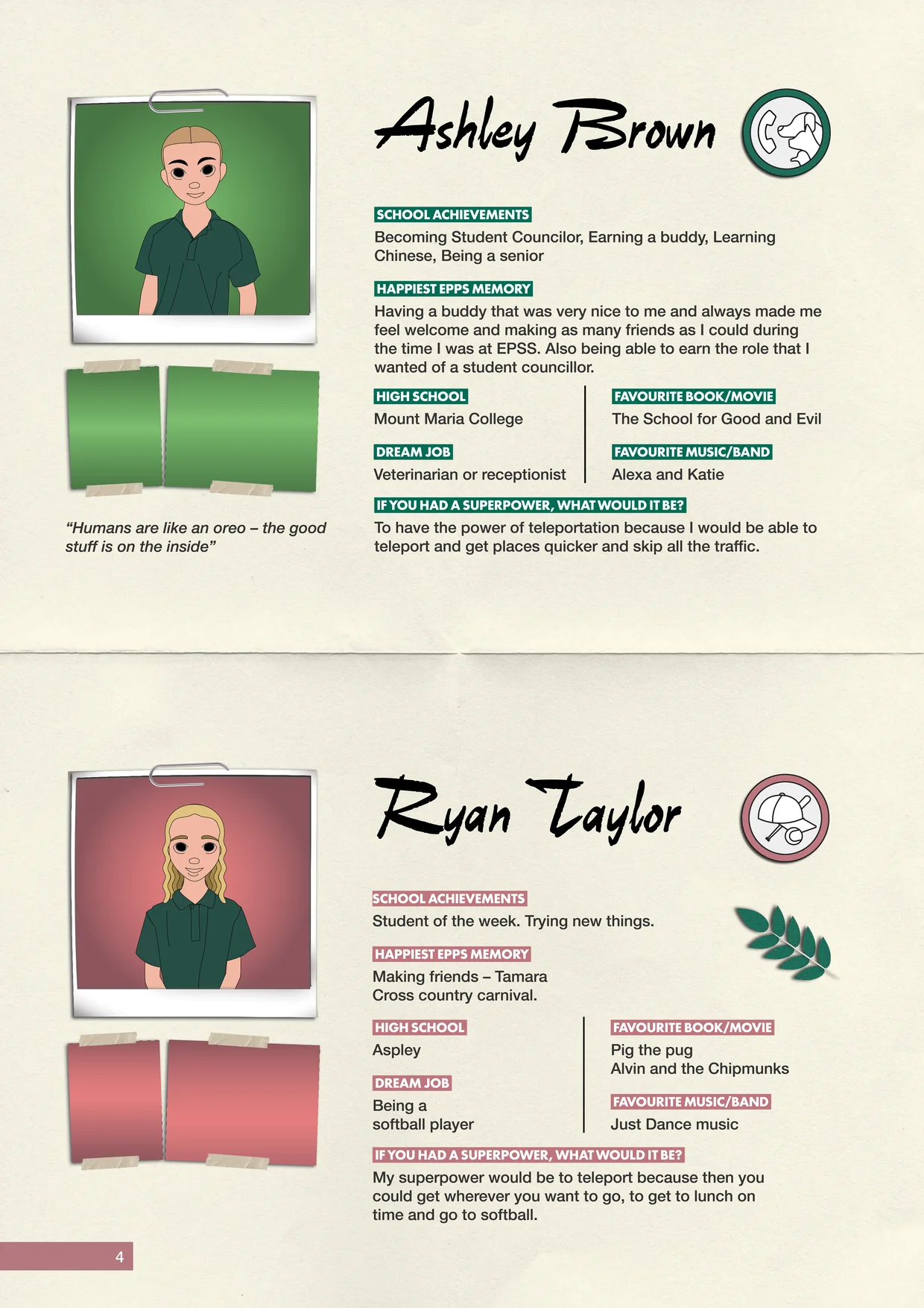
Descriptive icons
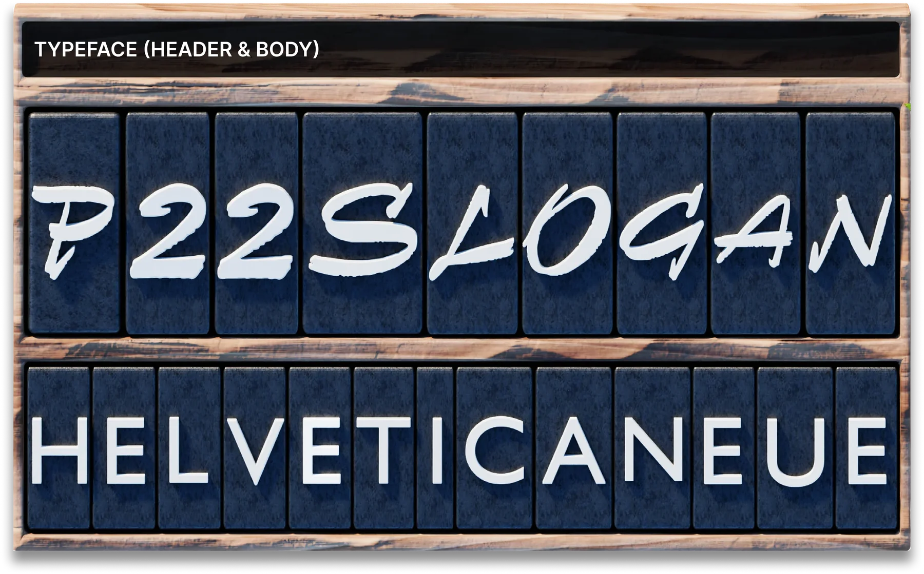
Each name is set in an expressive script, paired with clear Helvetica Neue for the answers.
Paper fold separator
Organic motifs
Leaves and botanical shapes echo the cover and tie every profile back to the school grounds.
Descriptive typography with natural elements.
Events
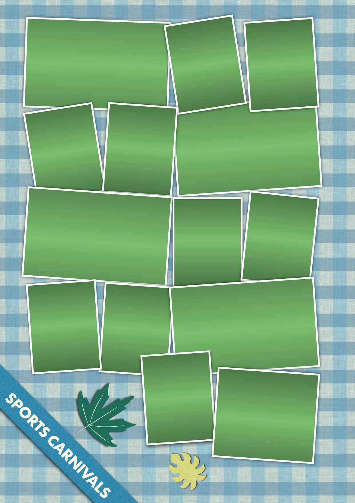
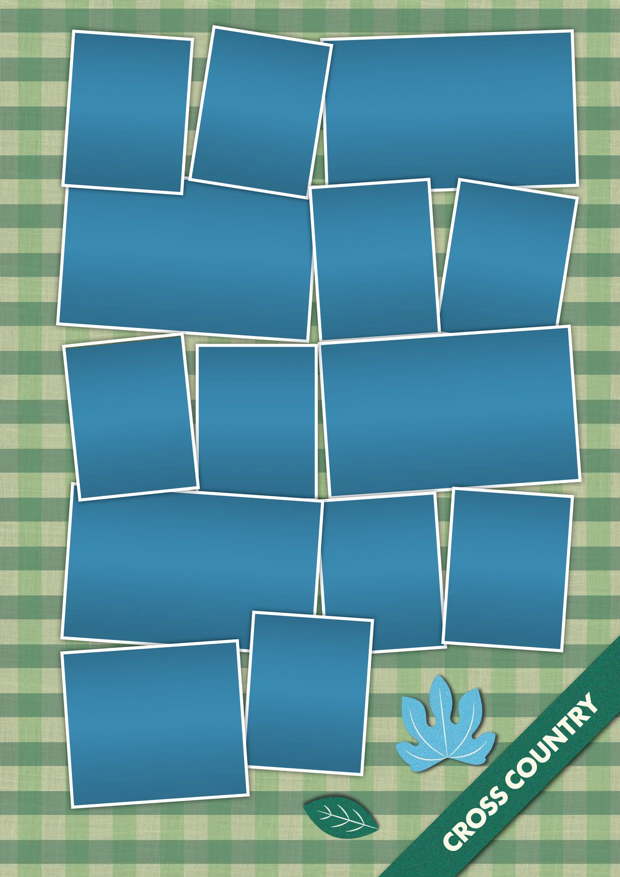
Photo collage
Overlapping photo frames capture the energy of the sports carnivals and cross country.
Gingham background
Picnic-style gingham in green and blue gives each event its own colour and a playful feel.
Photo collages on gingham backgrounds.
Back cover
Back cover with the Everton Park State School crest.
Book specifications
Dimensions
210 × 297mm
Paper type
Coated Paper
Cover
Paperback
Layout

Software
InDesign
Illustrator
Photoshop
Blender
Design thinking flowchart
Research
Everton Park
State School
Inspiration 1
Gathering visual examples
Concepts 1
Sketching concepts
Iteration 2
Concepts 2
Sketching Concepts
Inspiration 2
Gathering visual examples
Concepts 3
Sketching Concepts
Iteration 3
Finalised polished version